Data Analysis — Visualize a supply chain data using Power BI
The supply chain is one of the domains in that data analysis could be useful.
Data in the supply chain is mostly in a form of transaction data that each row represents 1 transaction of 1 item and 1 customer.
In this article, I will illustrate how I analyze the supply chain data. Hope that it will give some ideas to anyone who works on this type of data.
💽 Dataset
Data used in this article comes from https://www.kaggle.com/shashwatwork/dataco-smart-supply-chain-for-big-data-analysis
I will not go into the detail of each column. If you would like to know the detail, you can read in the DataCoSupplyChainDataset.csv file in the above link.
This is the dataset of Supply Chains used by the company DataaCo Global that contains 53 columns such as sale, shipment, item/customer id, and country. There are 180519 rows in the dataset and 1 row represents 1 transaction of 1 item and 1 customer.
📊 Visualization
For this supply chain dataset, I used Power BI as a visualization tool since it is easy to filter by a particular category of product or customer.
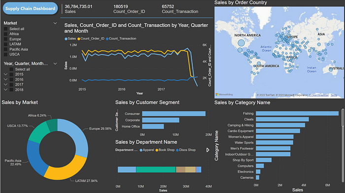
This is a snapshot of my dashboard.

I designed this dashboard using the concept “Read From Left To Right and Top To Bottom”.
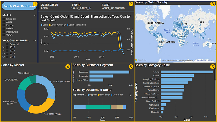
It could be divided into 6 parts as shown below.

- Part 1 is a filter plain including market and time filters.
- Part 2 is a summary of interesting parameters including totals sales, the total number of items sold (order id), and the total number of transactions. There is also a graph to illustrate the movements of these 3 parameters with time.
- The next 4 parts will show more detail about sales which I think is the most crucial parameter.
- Part 3 is a bubble plot on a world map. The larger the circle, the higher the total sales of that country.
- Part 4 is a donut chart that visualizes how much each market contributes to sales. If there are more than 5 categories, I will prefer a stack bar chart since the area (donut/circle chart) is harder to compare than the length (bar chart).
- Part 5 is the breakdown of sales based on customer segment and department name. I used a stacked bar chart for departments since there are many departments but most sales came from only some major departments.
- Part 6 shows sales by category sorted by sales of that category.
You can filter data by just selecting the filter pane in part 1 to clicking on the category you want to filter.
❓ Question
These are examples of questions that could be answered using this dashboard.
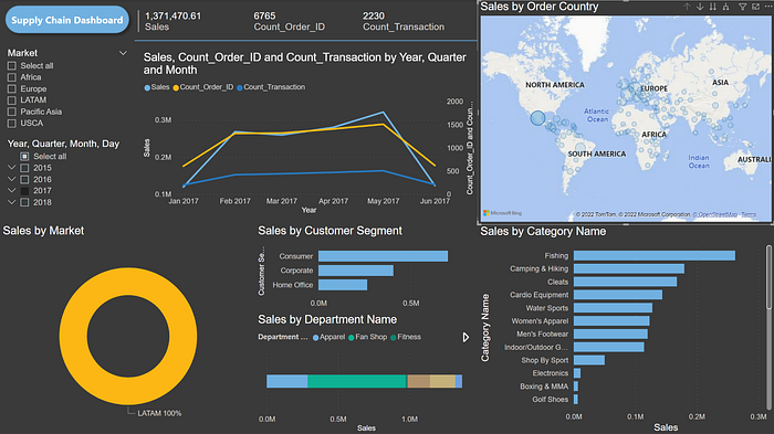
- Which country contributed the most sales in 2017? Filter year in part 1 to 2017. The map in part 3 shows that Mexico has the biggest circle. If you hover a mouse above that circle, you will see the country name and total sales of that country in 2017.

- Which product sold the most in Mexico in 2017? Click on Mexico in the map of part 3 to filter. Other charts will change according to the filter. As you can see from part 6, Fishing is the most famous item in Mexico.

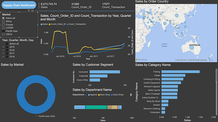
- What is our performance in Asia? From part 2, sales is high in early 2016. Then, it declines drastically in mid-2016 (Don’t know the reason. Maybe high sales in early 2016 was due to a marketing campaign). From part 3, the majority of sales were from Australia. From part 5, most of the customers are normal customers (not corporate) like other markets of this company. From part 6, fishing is the most famous product in Asia (like overall company)

There are a lot more insights to explore. You can also change the focus parameter from sales to others such as profit or the number of customers.
This is my first article about Power Bi. If you have any suggestions, feel free to let me know.
